
Mobile optimization used to be an afterthought for many websites in the early days of the Internet; most sites were created as 'lite' versions of their desktop sites. But in 2026, this has changed completely: more than 60% of all web traffic worldwide goes to sites that are accessed via mobile devices, and Google's algorithm is now only focusing on sites that use mobile-first indexing.
If you want to rank today, your mobile site has to be more than just responsive, it has to be fast and AI-ready with lots of "thumb-friendly" user experience features. Here are tips to help you craft a mobile-optimized SEO strategy.
1. Technical Foundations
Responsive web design is the standard for web design, but a site that just has a shrinking layout format does not make it a mobile-friendly site. In order to optimize your site for mobile search, you need to take a clean room approach to the technical aspects of the site.
- HTML5 vs Flash - Use only HTML5 to create your media files because Flash cannot be displayed on every mobile browser; Google will issue a warning about detecting Flash content.
- Viewport Tag - Include the meta name: "viewport" tag in the header of your HTML document. This tag tells the browser how to scale the webpage and adjust it to fit the device being used.
- Avoid Pop Ups - If your site uses a lot of pop-up ads that prevent the user from seeing the main content of the site when they arrive from search results, you can be penalised by Google. If you do have to use pop-up ads (e.g., for cookies or age verifications), they should be small enough to take up only a small portion of the screen so that the user will still be able to access the main content of the site.
2. Speed as a Ranking Factor
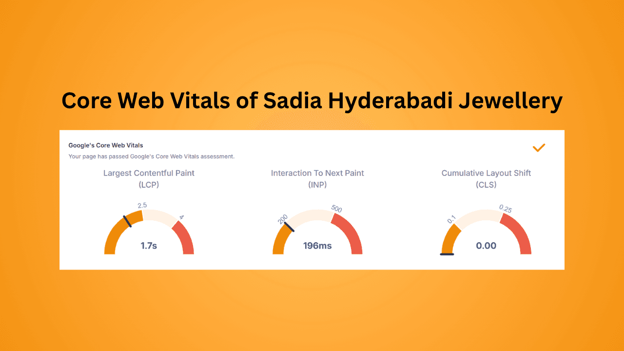
By 2026, speed will not only be measured by how quickly your page “loads,” but also by how quickly it becomes usable. Google uses Core Web Vitals to ascertain when your page is usable. These three metrics include:
- LCP (Largest Contentful Paint): For users to see the main content of your page in a timely manner, the LCP needs to be 2.5 seconds or less as per general best practice.
- INP (Interaction to Next Paint): This measurement replaces FID (First Input Delay) as the core INP metric. This measures the time between the user’s input using their device and the page responding to that input. To optimize this score, limit large JavaScript that locks the primary thread and prevents users from interacting with buttons on the page.
- CLS (Cumulative Layout Shift): To give your mobile users the a stable page experience as possible, make sure the button doesn't move after they have clicked it away from their finger.
Example: For our client - Sadia Hyderabadi Jewellery their LCP, INP and CLS have been successful in passing Google's Core Web Vitals assessment.
3. Develop a Good User Experience (UX)
Mobile users use their screens differently than desktop users. Customers who are using their mobile devices will generally use only their thumbs for interaction with the device's screen, and will generally be performing other activities while using their device, such as walking, in addition to the fact that they are typically not as precise in tapping the screen as compared to a computer.
- Tap size targets: Button and link tap targets are recommended to be a minimum of 44x44 pixels which allows for a finger to tap without hitting another link or button.
- Font size: Base font size is recommended at no less than 16px. If a user needs to zoom to be able to read your content, the SEO work is already lost.
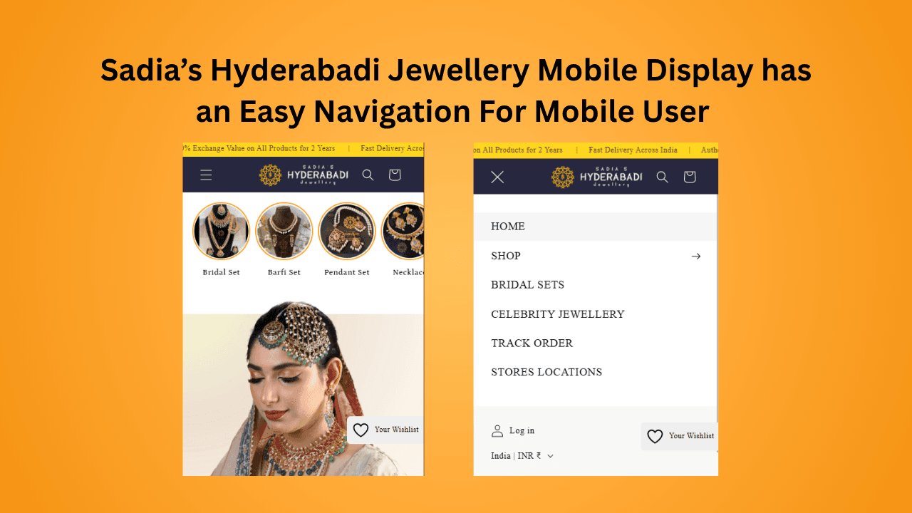
- Make navigation easy: To make it easier for users to navigate through your website use the “hamburger” menus to save space and that all key pages (Search, Cart and Contact) can be accessed within 1 tap of the user’s finger.
Example: Our client - Sadias Hyderabadi Jewellery has an easy to navigate mobile website with Search, Cart and Menu option making access easy for mobile users.
4. Content Strategy
Using mobile devices leads to a lot of "scanning" by users, who will not read much except when searching for something specific.
- Use Short Paragraphs: For mobile content use short paragraphs with 2-3 sentences.
- Informations: Write content that responds to the user course first at least within the first two paragraphs so they can be featured on an AI Overview or in a featured snippet.
- Accordions: Use "click to expand" accordions option for specifications/faq that would otherwise create a large page length and still allow Google to crawl all of the text.
5. Mobile Optimization for AI and Voice Search
In 2026, generative engine optimisation (GEO) will likely be closely related to mobile SEO. Voice search and AI search on Gemini or ChatGPT will change the way people search for answers online.
- Conversational Keywords: Instead of searching on Google "Delhi weather" people are now asking Google "What is the weather in Delhi today?" So use long-tailed questions like headings (H2 and H3).
- Structured Data: Use structured data (schema) in the format of JSON-LD for everything - Products, FAQ's, Recipes and Local Business so that AI models can better understand your data is a part of their algorithm and give rich results.
6. Local SEO
The Near Me searches come from mobile traffic majorly, so local businesses with a physical location need to use the following as part of their mobile SEO strategy:
- Be Consistent NAP: Use the same Name, Address and Phone number (NAP) across website, Google Business Profile, and social media accounts.
- Local Intent Keywords: Incorporate local keywords in your page's meta tags and content
- in order to have better visibility.
Example: For our client - Electromation Technologies, we have used local keywords in the meta title and description for better local visibility.

Conclusion
Mobile Search Engine Optimization for 2026 is about balancing your technical performance with an easily usable, human-focused design You will create a web site that search engines want to include in their search results as well as visitors could find easily on mobile.
The goal of SEO shouldn't just be to gain a higher rank, but rather to provide visitors with the answer they are searching for, regardless of where they are located and what type of mobile device they are using to view your site.
Is your website built for 2026? If not, ScaleOXperts offers execution-oriented SEO services which will help you achieve a Page 1 ranking. Schedule a Free Consultation now.
By Shafaq - ScaleOXperts.